Teradyne
View CodePen for the UI mockup!
[Context]
Teradyne is the global test and automation experts, powering next-generation technologies through advanced solutions. Behind every electronic device used, Teradyne's leading-edge test technology ensures that the device works right the first time, every time. Their portfolio of industrial automation solutions help manufacturers to develop and deliver new products quickly, efficiently and cost-effectively. Together, Teradyne companies deliver manufacturing automation across industries, applications and the world. For such results to happen, there is an engineering process that the engineers follow.
However, it is a 5 PDF-page flowchart site consisting of 100+ microscopic nodes. Both new engineers and those who have been with the company for an extended period, even if they have undergone the engineering process multiple times, find it challenging to grasp the process, identify their current stage, and locate the necessary files to complete their tasks. The site was not user-friendly and presented several maintenance challenges.
Task: Redesign and implement the engineering process flow. Improve the user experience and maintenance.
[The Challenge]
With the complex engineering process causing inefficiency and various levels of frustrations, the directors and engineers asked me to make significant improvements and redesign the user experience. Initially conceptualized by a single director, it served as a means to disseminate information more effectively than mere files, yet lacking input from engineers. It yielded a long five-page process flow that had little consideration to the experience of the end-user. If I wanted to succeed, it was clear I needed to shift focus to the user, while also ensuring that the engineering process is a centralized hub for encapsulating procedures and facilitating convenient access to information and files. The responsibilities also entails developing the engineering process with a focus on delivering versatile platforms and products across diverse departments. This involves crafting responsive layouts optimized for seamless user experience across mobile, tablet, and desktop devices. I started with a brand strategy which focused on simplifying the engineering process for all the engineers.
[Breaking Down the Problem]
Due to confidentiality, I cannot provide the full details of the project. However, I have abstracted the process flow and details to show the big picture. The engineering process consisted of many, many, and MANY nodes.

WOW! Now imagine this flow but five times more in length! Confusing, isn't it? The flow consists of not just the process for electrical engineers, but mechanical, software, audit, and more. These are based on the shape and color of the node. As I approach this problem, I think to myself, "How do I simplify this process?"
[Talking to the Stakeholders]
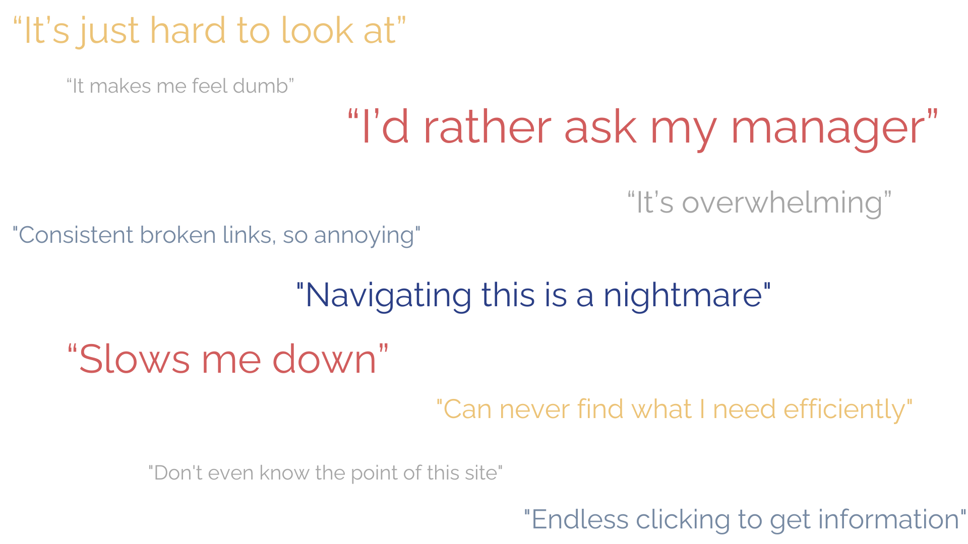
In order to get a better grasp of the issues that engineers, managers, and directors were having, I conducted user interviews to understand their pain points, challenges, and needs more deeply. By engaging directly with the key stakeholders, I was able to gather valuable insights that helped inform the project's direction and priorities. Here are the biggest takeaways from the user interviews with the general populations of:
- Electrical Engineers: Information overload. Inefficient data retrieval.
- Software Engineers: Confusing.
- Audit Engineers: Convoluted information retrieval.
- Engineering Departmental Managers: Always get bothered to send files.
- Engineering Departmental Directors: Always get bothered to send files.
NOTE: Many employees are in different timezones, so coordinating meetings and availability can be challenging. Also, email and messaging for assistance often face lengthy response times.
[The Big Idea]
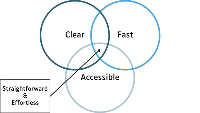
As a new addition to the engineering team, I found the company's engineering processes to be highly complex, requiring multiple explanations from various engineers, managers, and directors before I could even begin to grasp the workflow. It was clear that the convoluted process flow was a source of confusion, not just for newcomers like myself, but also for seasoned employees who had been with the organization for some time. It was clear that I should focus on making the flow straightforward and the experience effortless. To do so, I focused on 3 things: speed, clarity, and accessibility.
[Ok, How Do I Get There?]
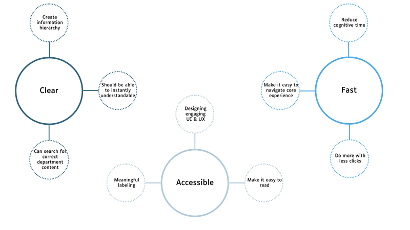
As a new addition to the engineering team, I found the company's engineering processes to be highly complex, requiring multiple explanations from various engineers, managers, and directors before I could even begin to grasp the workflow. It was clear that the convoluted process flow was a source of confusion, not just for newcomers like myself, but also for seasoned employees who had been with the organization for some time. It was clear that I should focus on making the flow straightforward and the experience effortless. To do so, I focused on 3 things: speed, clarity, and accessibility.
[Design Explorations]
I began drafting various representations and visualizations. After designing medium-fidelity prototypes, I conducted usability testing sessions to gather feedback. This iterative process continued until a design was reached that the majority of users found to provide a satisfactory and effortless user experience.
BREAKING DOWN THE ORIGINAL ENGINEERING PROCESS FLOW
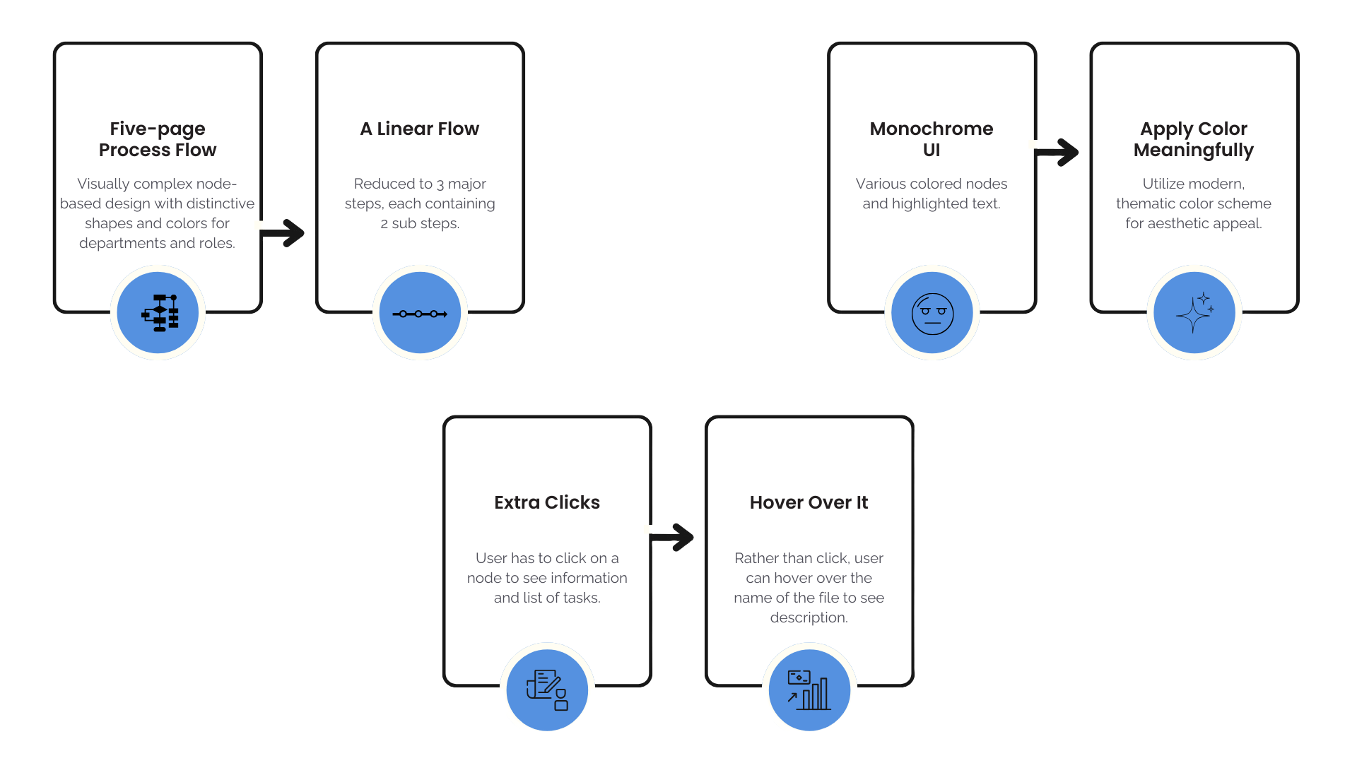
The original process flow was an interactive PDF on the company's engineering intranet SharePoint site. that required users to navigate through several steps to access key information. First, they would need to locate the specific node in the process flow that corresponded to the step they wanted to review. Then, they would have to click on that node to read the details and access the associated files. This multi-step process placed an unnecessary burden on the user, especially if there is important information. To address this pain point, I prioritized designing a solution that would display the most important information upfront (i.e. tasks that requires project managers to sign off on, tasks that have overlapping phases), without requiring users to click through each individual node. This is followed by also redesigning the convoluted process flow into a more straightforward and intuitive format. The goal was to minimize the number of interactions needed to surface the critical details, providing a more streamlined and efficient user experience.
[The Final Changes]
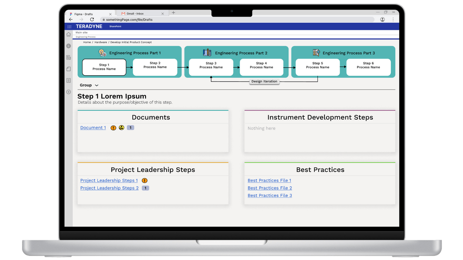
In a few weeks, I redesigned the interactive, five-page PDF into a user-friendly web application. I stuck to my principles and focused on my strategy of making the experience more straightforward and effortless.

[The Final Design]
The design follows a consistent approach across the different departments. The high-level process flow is prominently displayed at the top of the page. Users can click on any of the sub-steps to reveal the corresponding content underneath. An integrated filter allows users to view information specific to their respective department.The task titles are underlined, and some are accompanied by icons that depict important pieces of information. While not every task has an associated icon, users can hover over the title or the icons to see detailed descriptions. This approach minimizes the number of clicks required, as all the information is readily available.
[IMPLEMENTATION TIME]
Initially, I implemented the web design using a React Native App that leveraged a SharePoint list as the database. However, I encountered a roadblock when security concerns arose, as SharePoint did not permit a fully customized web application to be hosted on their platform. As a result, I pivoted to implement the entire application directly within SharePoint. This required me to invest significant time in learning the extensive features and capabilities of SharePoint to customize the site as extensively as possible within the platform's constraints.
To achieve a tailored look and feel, I utilized HTML and CSS to create custom styling that aligned with the project's branding. By writing clean HTML, I structured the content in a way that was both semantically meaningful and visually appealing. I applied CSS to enhance the user interface, ensuring that elements like buttons, forms, and navigation were not only functional but also aesthetically pleasing. This combination allowed me to create a user-friendly experience while maintaining the flexibility needed to adapt to the limitations of the SharePoint environment.
View CodePen for the mockup!
[IMPLEMENTATION TIME]
I made the web application be a template for other department to adapt as I mainly implemented it for electrical, software, and audit. Before ending my time at Teradyne, I wrote a manual for maintenance of the site.
- A satisfaction rate of more than 80% from the engineers (i.e. electrical, software, and audit).
- The managers were seeing less notifications for help with finding a file.
- More than half of directors, managers, and engineers really liked the minimal, modern aesthetic of the site as it made the experience for friendly and fun.
- All gave a SUPER-LIKE on the use of icons to represent important information!